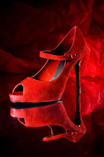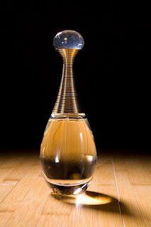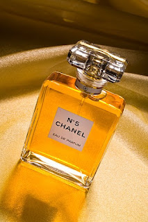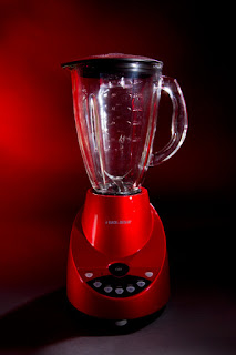


One of my favorite types of photography is the product "beauty shot." Instead of flat, even lighting of "catalog style" photography that clearly shows every detail of the product, there is a beautiful interplay of light and shadow. Shadow, a mysterious area of the picture where the product and props are suggested, but not clearly shown. Shadow, creating contrast to the highlighted areas and making them pop off the page. Shadow, making the product look more expensive and attractive, even if it is a $26 blender from Target. See examples at http://www.photographer-product.com/
In beauty style product photography, the light coming from behind the product is often more important than the light coming from the front. This "rim lighting" outlines the edge of the product and creates the glowing shape that separates it from the darker background. It is "hard light", meaning it is not softened or diffused with a soft box or umbrella. I often grab the hard light coming from behind the product, and bounce it back into the front or side of the product with a small, silver foil reflector.
A good illustration of the difference between hard light and soft light is as follows: soft light is like when the sun is covered with clouds. The shadows appearing on the ground have soft edges, and are not clearly defined. Hard light is like when the sun is shining in a blue sky with no clouds. The shadows are hard edged, clearly defined and are very dark.
During the early years of my photography career I, like most new photographers, used soft light almost exclusively for all my photography, portraits and products alike. It was safe, boring, and gave the impression that I was a professional. Light that is defused, directionless and shadow less is flat and lackluster. That’s one reason that overcast, cloudy days are not as cheerful as bright, sunny days. Back in the 80s I used umbrellas, moving to soft boxes in the 90s. For the past 10 years, I have used a mix of hard and soft light. The hard light defines the shape and texture of a product, while the soft light lightens the shadows caused by the hard light and allows the viewer to see details in the shadows. This mix of lighting styles causes my images to have more "punch", higher saturation, more texture, and more interesting defined shapes. Although some of my clients still ask for shadow-less "catalog style" image, I prefer shooting my own style with a mix of hard and soft light.
Most of my work is done with at least two and as many as eight lights. If you count the reflectors, there are sometimes as many as twelve light sources in my images. However, there is always one main or “key” light that has more power than any other light source. I always want to see the shadow cast by this light, regardless of how many lights fill those shadows. The correct placement of the key light can be determined by asking yourself the question “what is the most important feature of my subject, and what do I want to make sure people see? What is the main selling point I want to emphasize? Is it texture, shape or color?” That is the feature in the product the lighting must show off.

